The Uncomfortable Truth About First Impressions
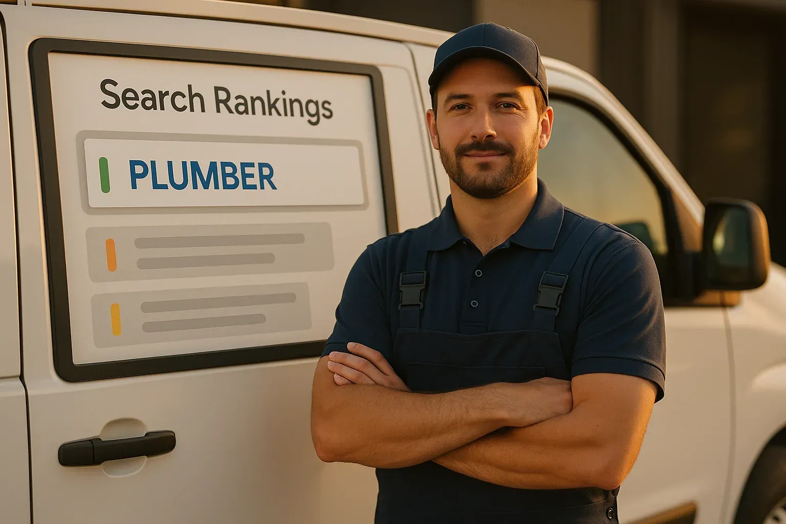
Here’s something that’s going to sting a little: a homeowner with a clogged drain just Googled “plumber near me,” saw three results, clicked on all three websites, and chose to call your competitor. Not because your competitor is a better plumber. Not because their prices are lower. Because their website looked more professional.
That’s not speculation. Research from Stanford’s Web Credibility Project found that 75% of consumers admit to judging a company’s credibility based on their website design. And a study published in the journal Behaviour & Information Technology confirmed that it takes just 50 milliseconds — five hundredths of a second — for a visitor to form an opinion about your website.
In the trades, your work speaks for itself. But your website speaks before your work ever gets a chance to.
The Side-by-Side Test
Try this right now. Google your trade and your city — something like “electrician [your city]” or “plumber near me.” Open the first three or four results in separate tabs. Now flip between them.
Which ones look modern, clean, and professional? Which ones look like they were built a decade ago? If you’re honest with yourself, how does your website stack up?
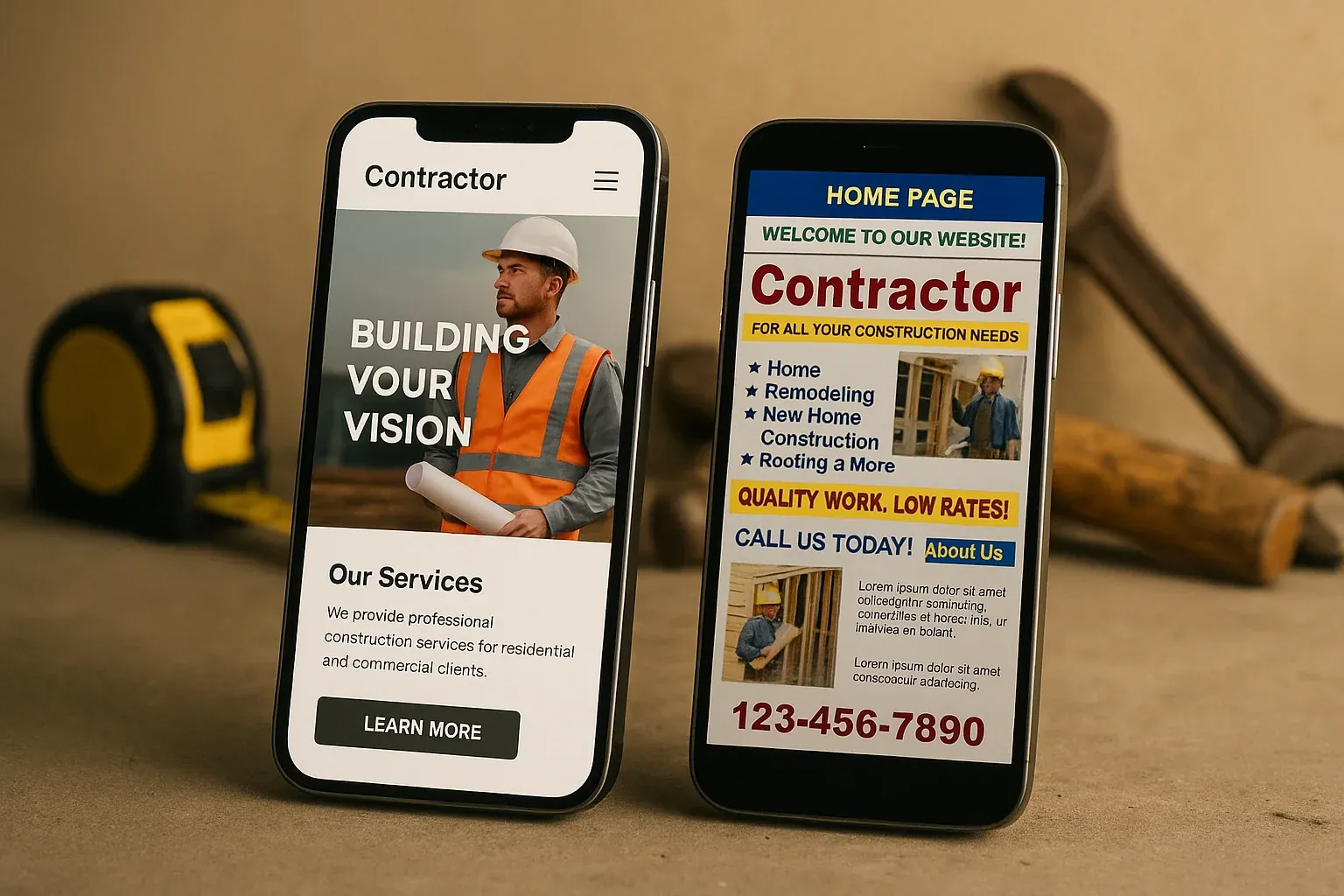
Here’s what a modern contractor website looks like in 2022:
- Clean layout with plenty of white space — not crammed with text and graphics
- Professional color scheme — two or three consistent colors, not a rainbow
- Large, readable fonts — no more 12-pixel body text
- Real photography — actual job photos, team shots, branded trucks
- Fast loading — the page appears almost instantly, no spinning loader
- Mobile-perfect — works flawlessly on a phone without any zooming or scrolling issues
And here’s what an outdated contractor website typically looks like:
- Crowded text with no breathing room
- Clip art or blurry stock photos from 2010
- Flash animations or auto-playing music (yes, these still exist)
- Tiny text that requires zooming on mobile
- A “Welcome to our website!” banner
- A hit counter at the bottom of the page
If your website looks like the second list, every homeowner who visits is unconsciously comparing you to the competitor whose site looks like the first list. And in that comparison, you lose — regardless of your skill level.
How Homeowners Actually Compare Contractors
When a homeowner needs a contractor, they don’t just find one website and call. According to a survey by the National Association of Home Builders, homeowners contact an average of 3 to 5 contractors before making a decision.
Here’s what the typical process looks like:
- Search Google for their needed service plus their city
- Check the Google Maps “Local Pack” — the top 3 map results with ratings
- Click through to 3-4 websites from both the map pack and organic results
- Compare — consciously or not — the professionalism, trustworthiness, and modernity of each site
- Call the one or two that looked the most legitimate and professional
Your website is being viewed side-by-side with your direct competitors. It’s a beauty pageant whether you like it or not.
The Trust Gap Between Modern and Outdated
When we say a website “looks outdated,” we’re not just talking about aesthetics. We’re talking about trust signals that homeowners process subconsciously.
An outdated website communicates:
- “This business might not be active anymore”
- “They don’t invest in their own business”
- “If their website is this neglected, what does their work look like?”
- “Are they even legitimate?”
A modern website communicates:
- “This is an active, thriving business”
- “They care about how they present themselves”
- “They’re professional and take their work seriously”
- “I can trust these people in my home”
Is that fair? Maybe not. But it’s reality. And in a competitive market where homeowners have plenty of choices, that trust gap is the difference between getting the call and being skipped over.
What “Modern” Actually Means (It’s Simpler Than You Think)
The word “modern” might sound intimidating, like you need some kind of cutting-edge technology. You don’t. A modern trades website is actually simpler than an old one. Here’s what it boils down to:
Clean, uncluttered design. Less is more. A clear headline, a professional photo, your phone number, and a strong call-to-action. That’s your homepage above the fold.
Fast performance. Modern websites are built with lightweight code and hosted on fast infrastructure. They load in under 2 seconds. No spinning wheels, no waiting.
Mobile-first layout. The site is designed to work perfectly on phones first, then scaled up for desktop. Not the other way around.
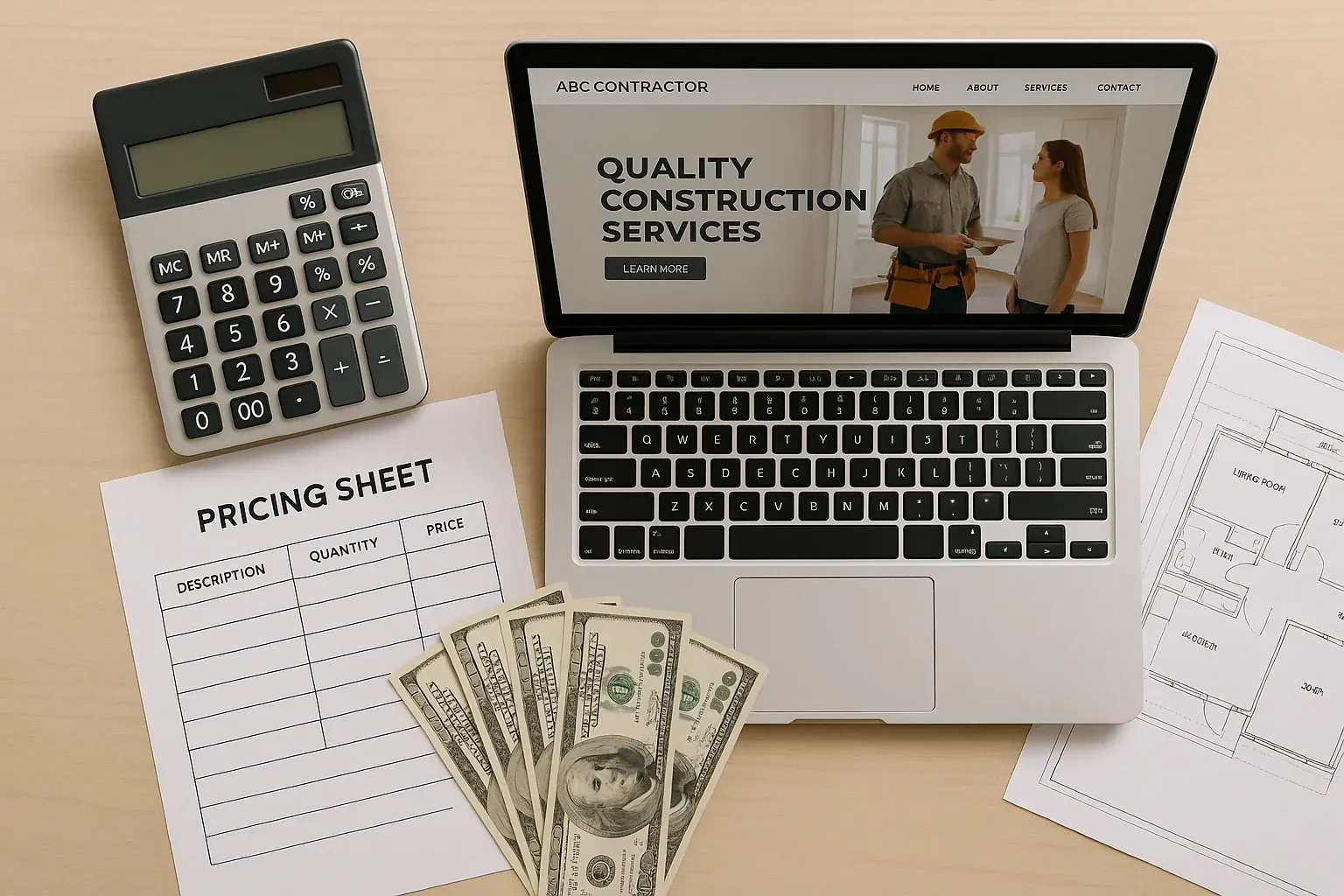
Real content. Your actual services, your actual service area, your actual reviews, your actual photos. Not filler text and stock imagery.
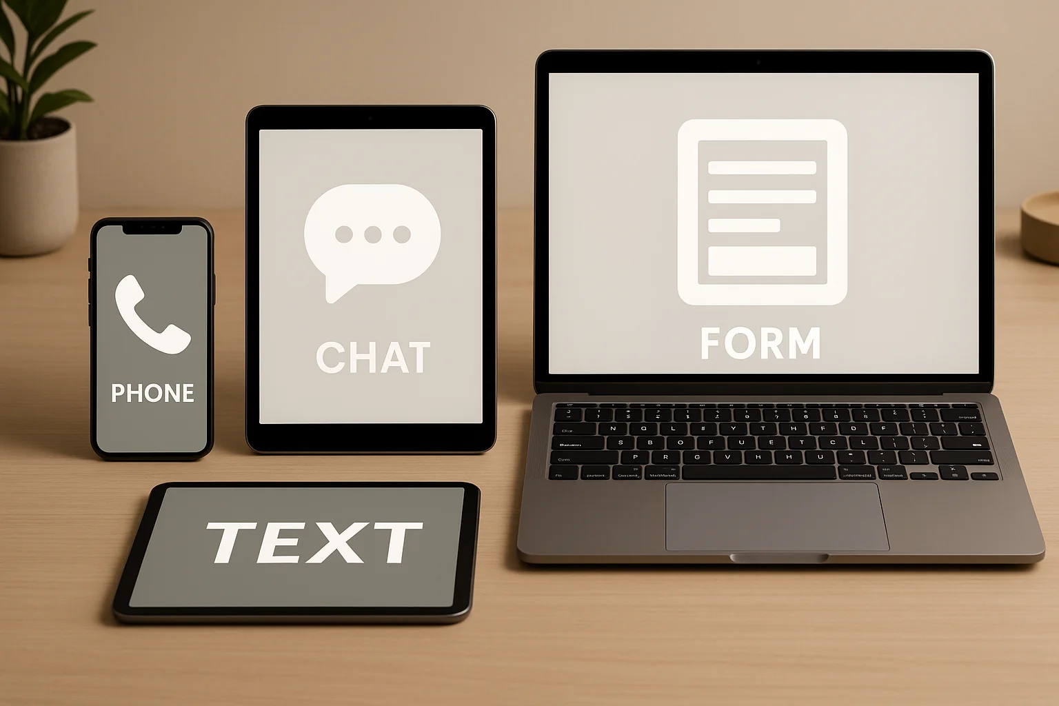
Clear calls to action. Every page on your site should make it dead simple for the visitor to call you, text you, or fill out a form. No hunting, no guessing.
That’s it. No fancy animations, no complicated features, no gimmicks. Just a clean, fast, trustworthy presentation of your business that makes it easy for customers to reach you.
The Competitive Advantage Is Real
Here’s the good news: most contractors in most markets still have terrible websites. That means the bar is low, and the opportunity is enormous.
If you’re one of the first contractors in your area to upgrade to a genuinely modern website, you’ll stand out immediately. Homeowners will notice the difference. Google will reward you with better rankings. And your phone will ring more often.
Think about it this way: if you showed up to a job in a clean, branded truck with professional uniforms and organized tools, and your competitor showed up in a rusted van with no signage, who would the homeowner trust more? Your website is that truck. It’s the first thing customers see, and it shapes every interaction that follows.
What to Do Next
Take an honest look at your website. Better yet, ask a friend or family member who doesn’t work in the trades to look at it and give you their gut reaction. Ask them: “Would you call this company based on this website?”
If the answer isn’t an enthusiastic yes, it’s time for an upgrade. Not because websites are exciting (they’re not — your actual trade is what’s exciting). But because in today’s market, your website is the front door of your business. And right now, your competitor’s front door looks a lot better than yours.
Webpage Workmen
We build modern, lightning-fast websites exclusively for tradesmen. Plumbers, electricians, HVAC techs, roofers — we speak your language and we are here to help your business grow online.